DAYMOON
SAFETY, FINALLY DESIRABLE.
FULL BRANDING FOR A SAFETECH BUILDING A NEW CATEGORY IN BRAZIL.
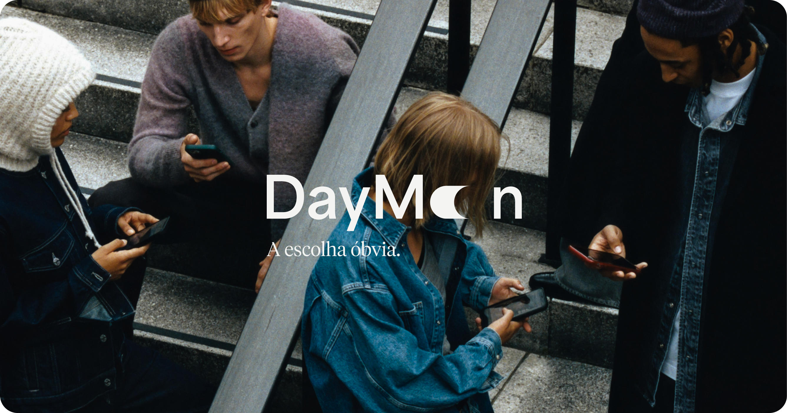
In Brazil, feeling safe is a concern shared across every income, neighborhood and job title, and yet the security market answers it with alarms, sirens and the same cold, urgent tone. DayMoon arrived with a different ambition: not a single product, but a layer of protection for everyday life, starting with an app that steps in the moment something goes wrong. The challenge was to build a brand bold enough to found a category of its own, one that makes safety feel light, desirable and easy to say yes to, without ever using fear to sell it.
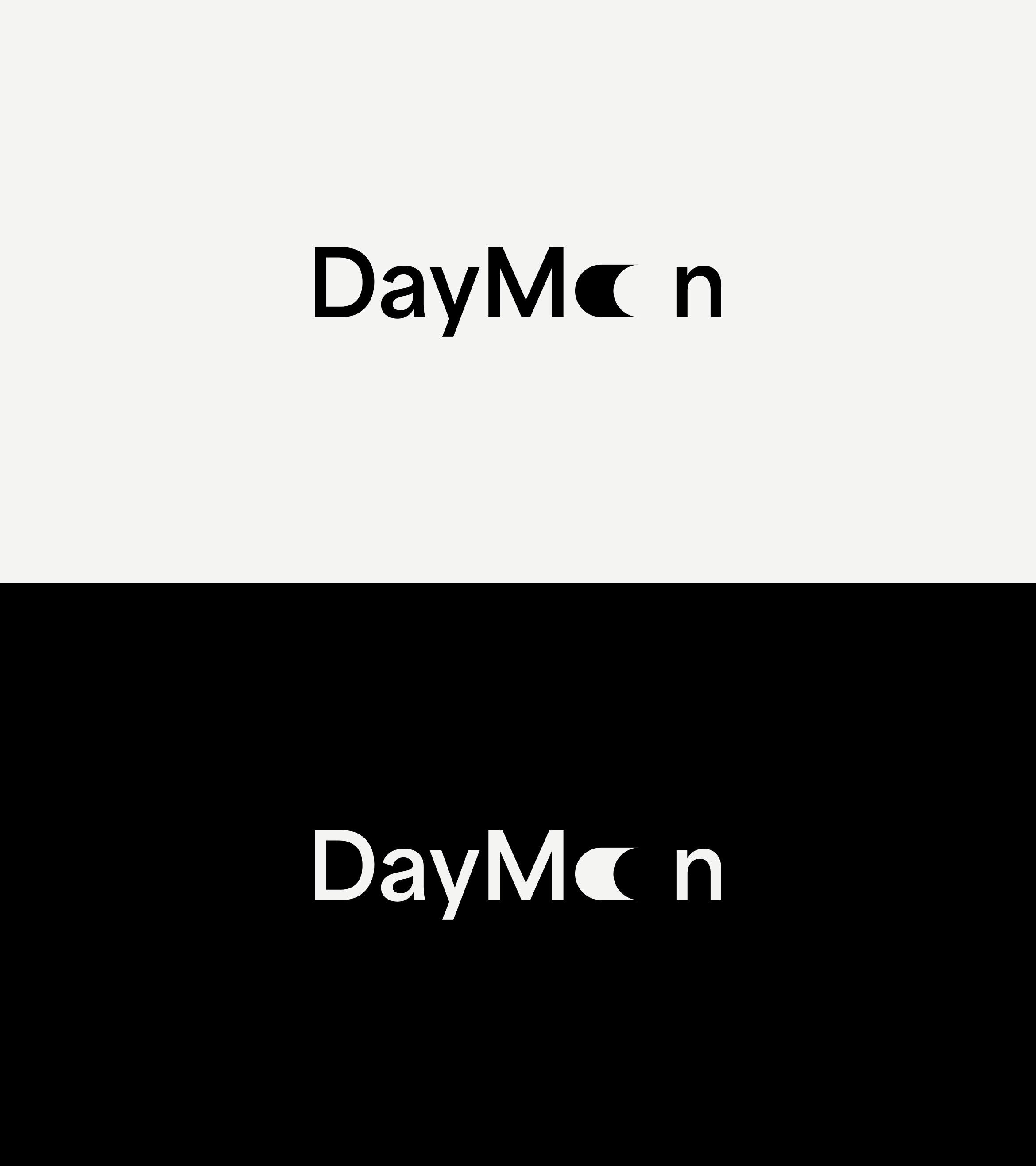
The idea was already in the name: the moon never disappears during the day, it simply stops calling attention. That is exactly how DayMoon wants protection to work, always there and never in the way. The wordmark takes this literally. The double “o” gives way to a single moon, a solid form that fills the space of two letters and leaves a quiet pause behind it. A clean geometric sans keeps the reading simple and contemporary, so the one gesture that matters can stand out.
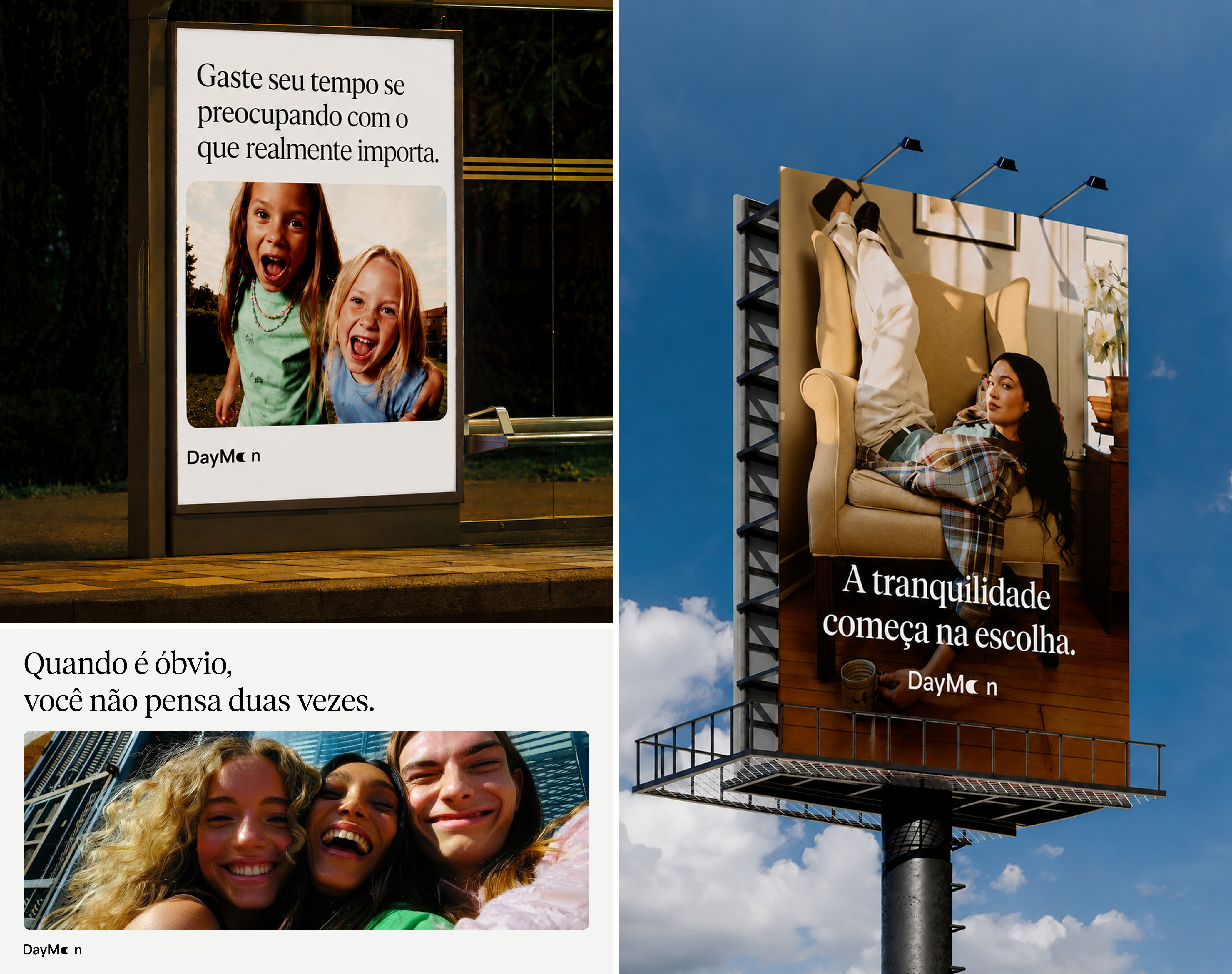
The positioning, The Obvious Choice, turns protection into the easiest decision of someone’s day. Instead of warning people about what they could lose, the brand talks about what they gain: time, lightness and the calm of having already decided right. Headlines set in an editorial serif sit over warm, everyday scenes, in a tone that is confident and a little provocative, as if there were simply no reason not to.

On its own, the moon becomes the brand’s symbol: a half circle stretched into a capsule and cut by a perfect curve. It reads as a crescent, but also as a switch that’s already on, a quiet reminder that protection is active even when no one is thinking about it. It’s simple enough to work at any size, from an app icon to a small engraved detail.
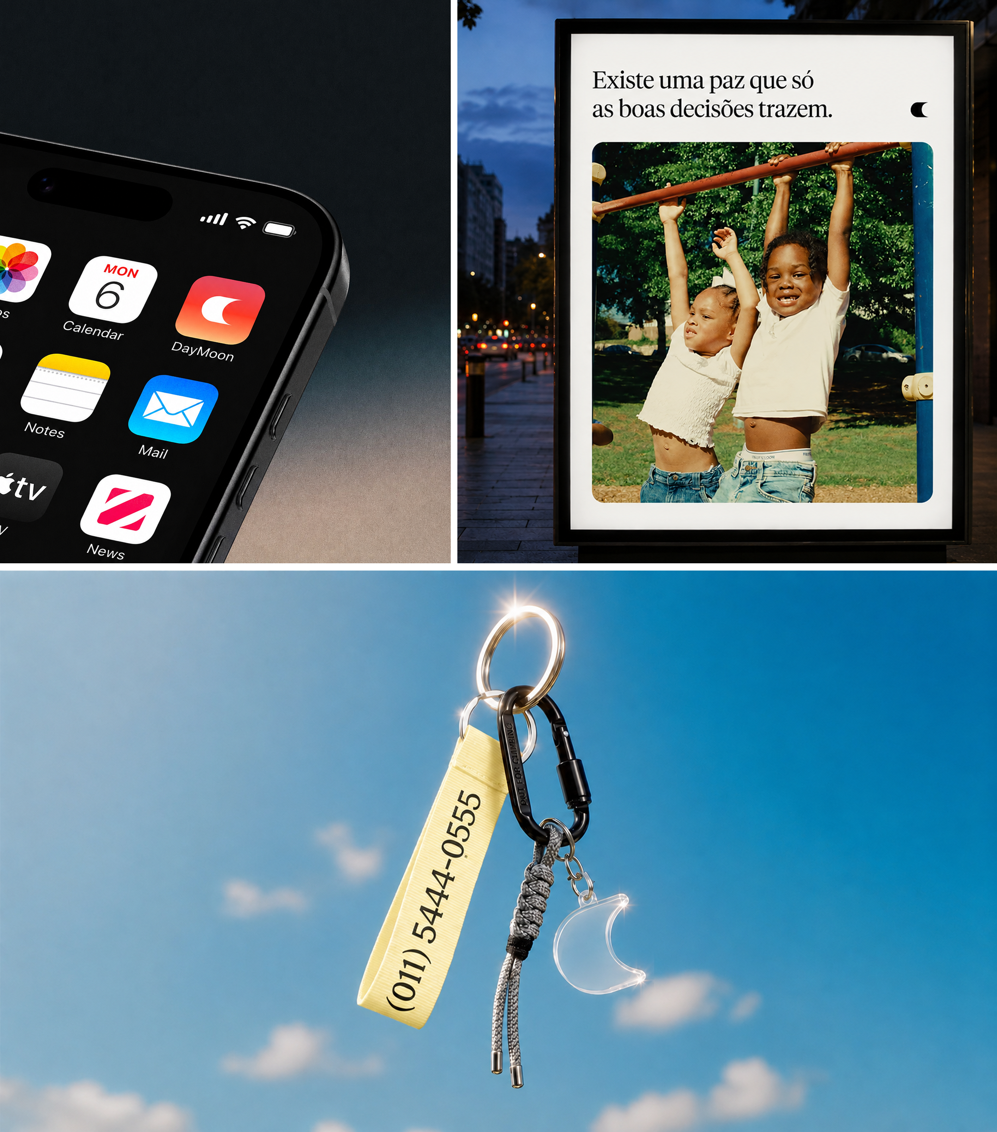
DayMoon lives where people already are: on the home screen, among the apps they open every day, and on the street, in the middle of ordinary routines. The keychain makes the promise tangible, with the assistance number printed on the strap and the moon hanging in clear acrylic, light and almost transparent. It’s protection you carry without feeling the weight.
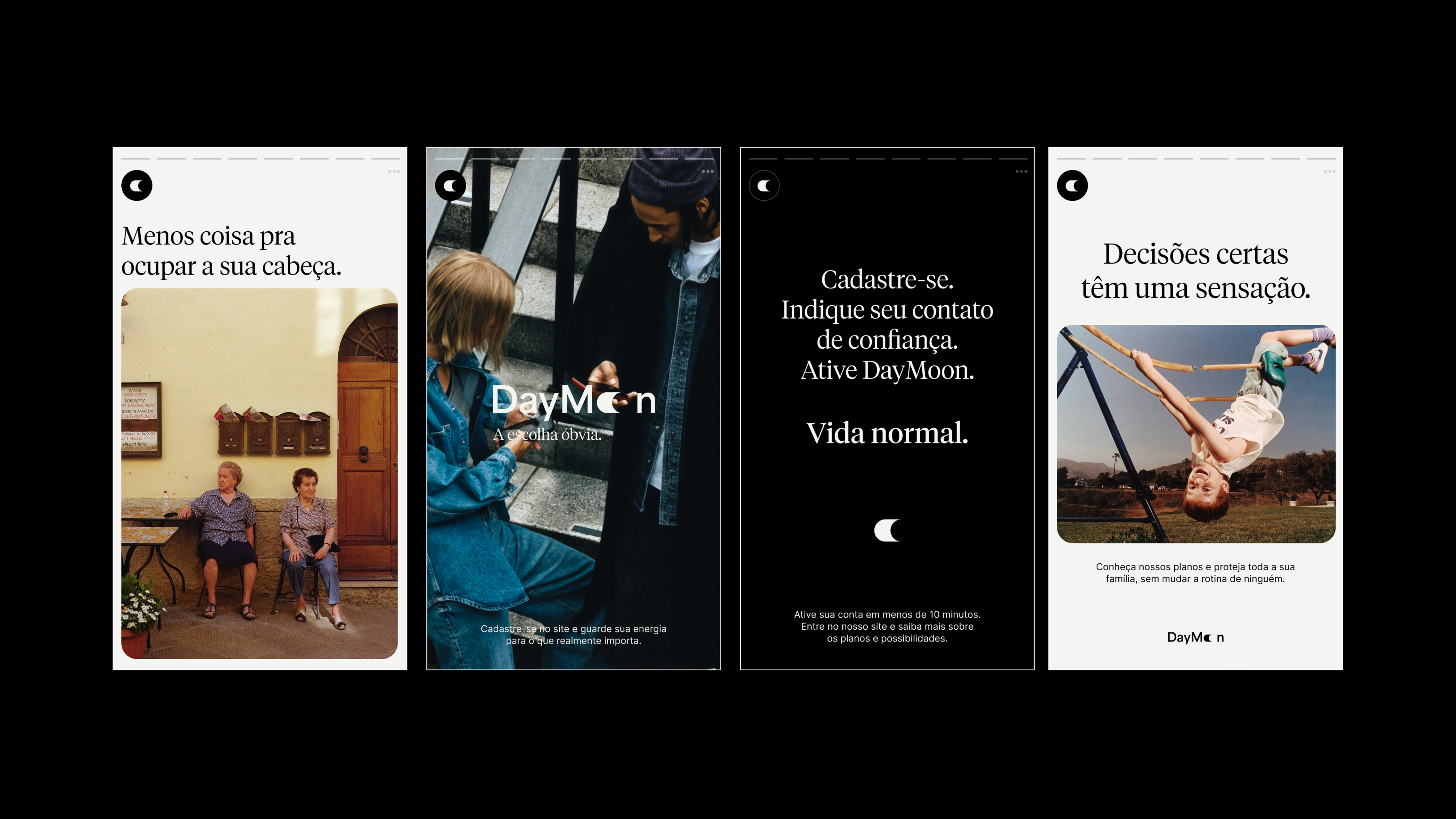
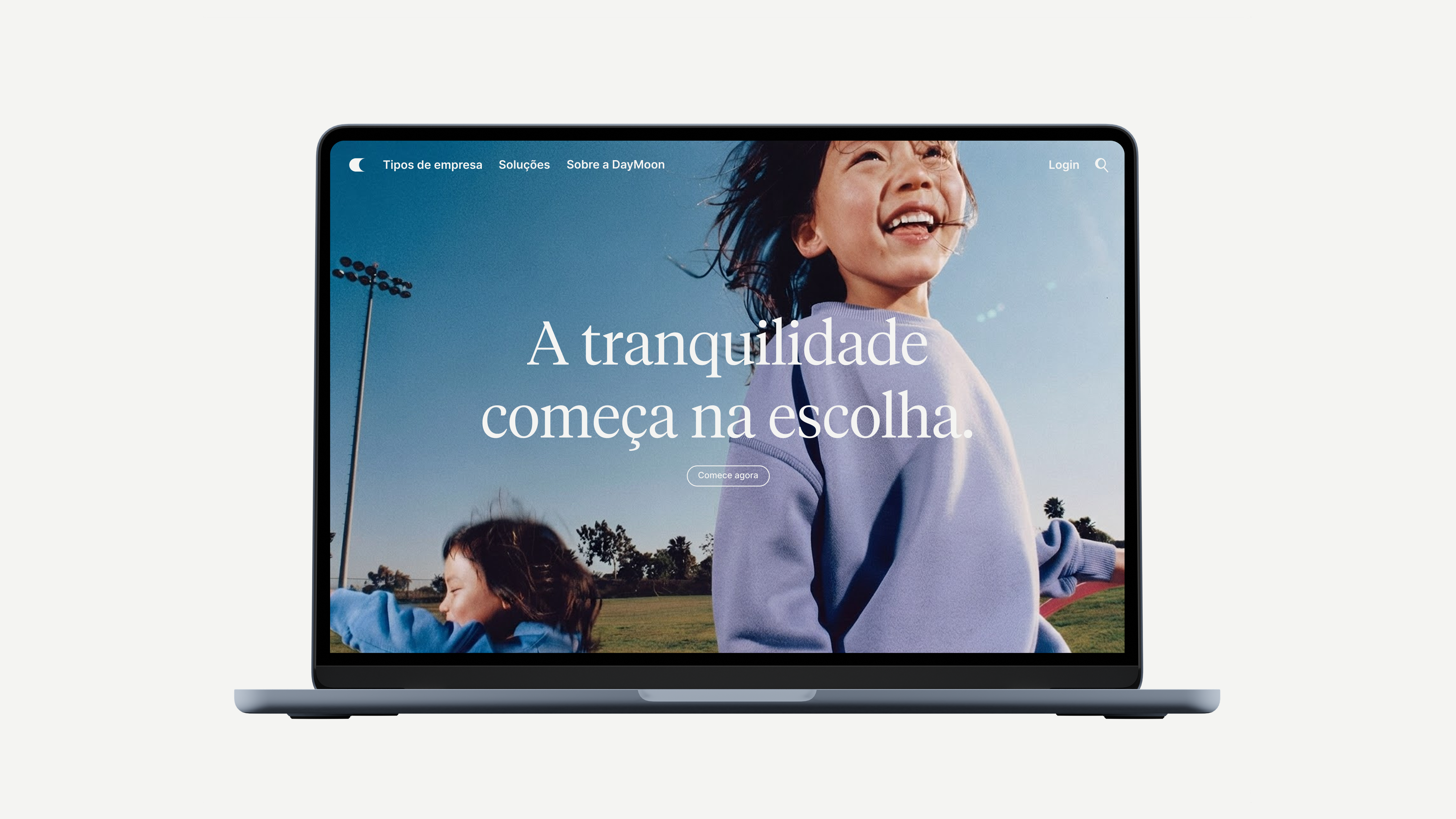
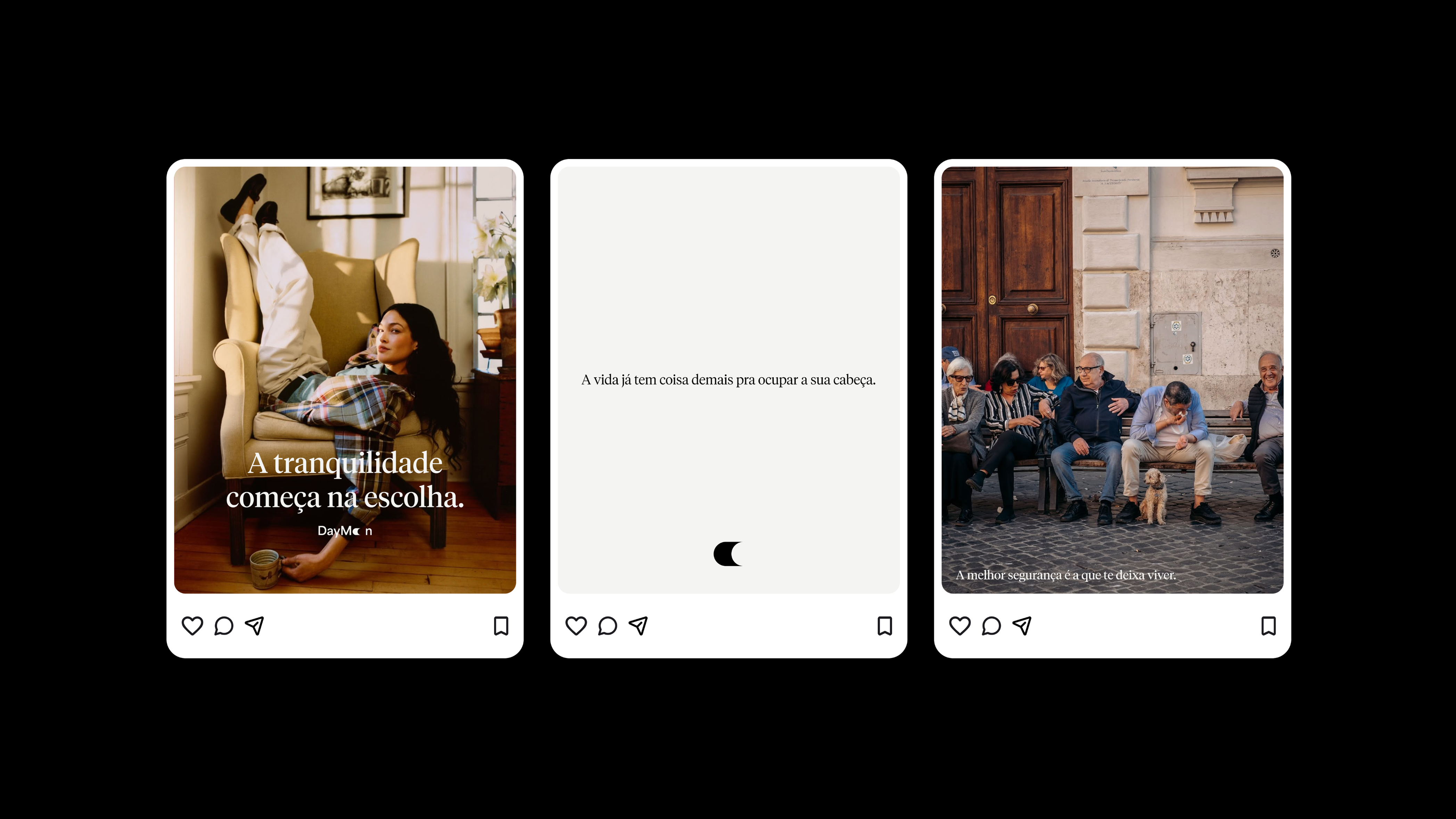
On social media and the website, the brand speaks in short, certain sentences and gives the images room to breathe. Onboarding fits in four lines: sign up, add a trusted contact, activate DayMoon, carry on with life. The photography follows the same rule, with real people in unremarkable moments. The best result of feeling safe is an ordinary day.

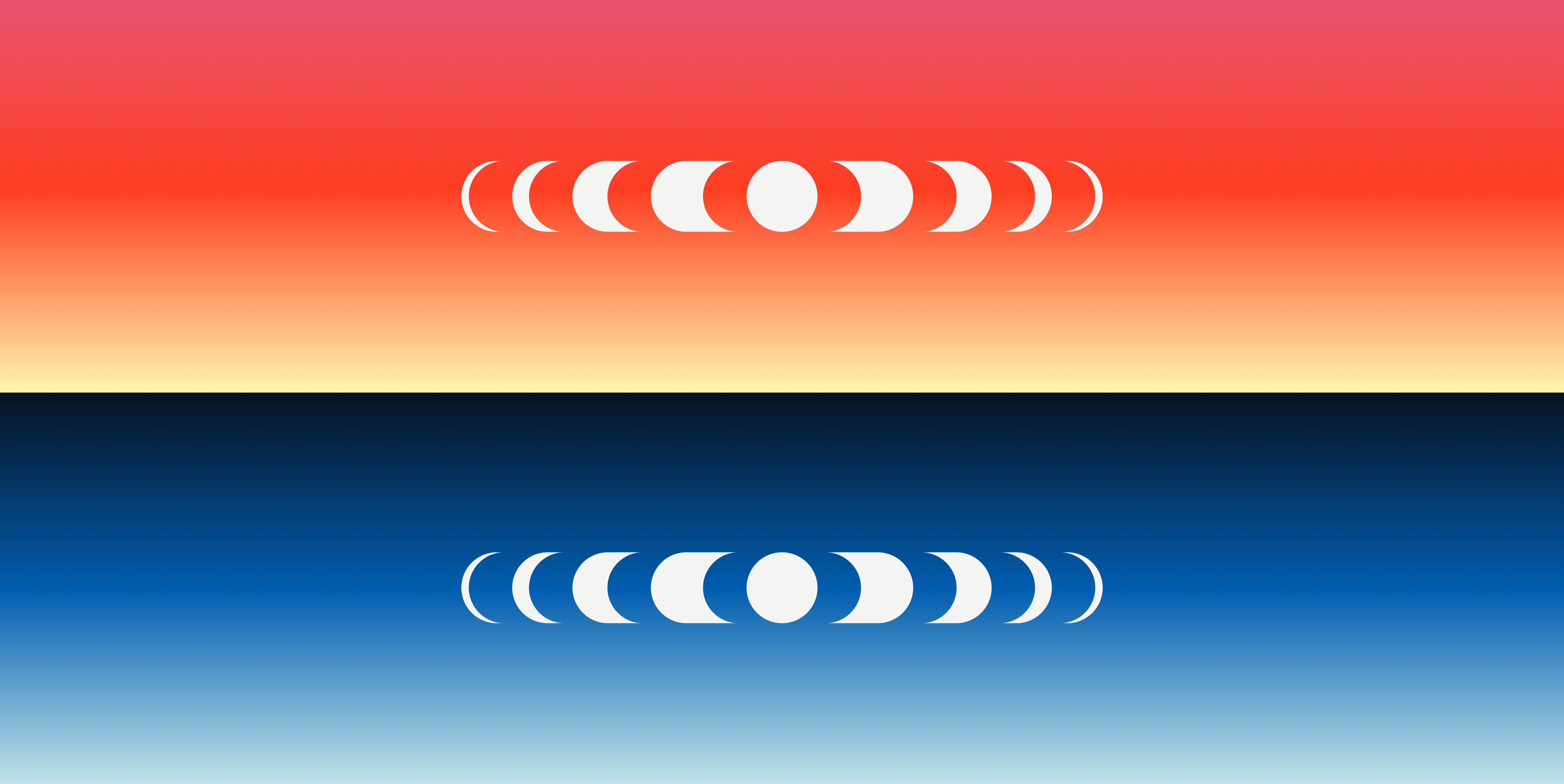
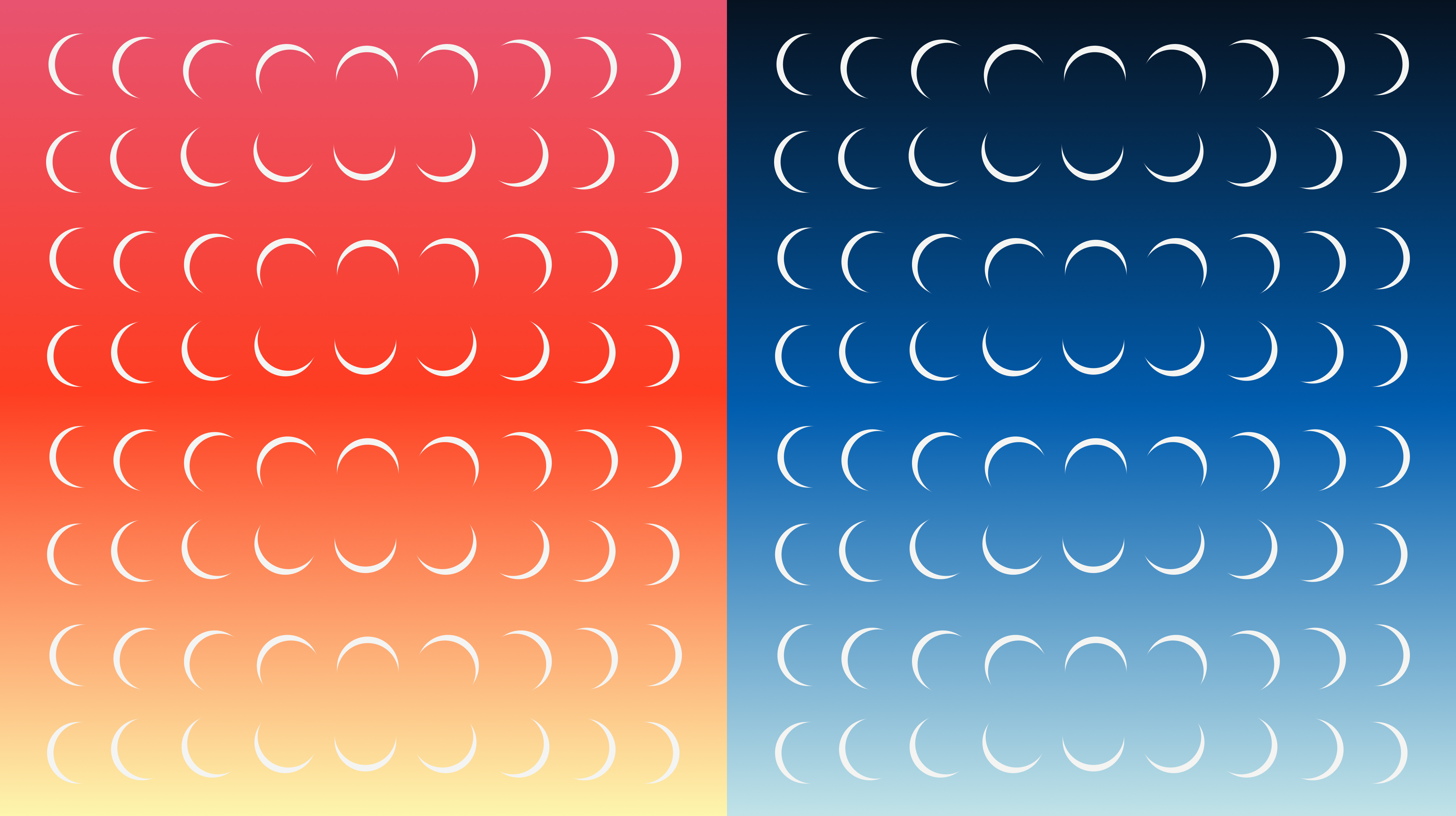
Color comes straight from the sky. A day gradient, moving from pink through red to soft yellow, brings warmth and energy. A night gradient, from deep navy to pale blue, brings calm and continuity. Together they cover the full 24 hours DayMoon is present, and give the system room to shift its tone, more vibrant when it speaks to people and more restrained when it speaks to businesses and partners.
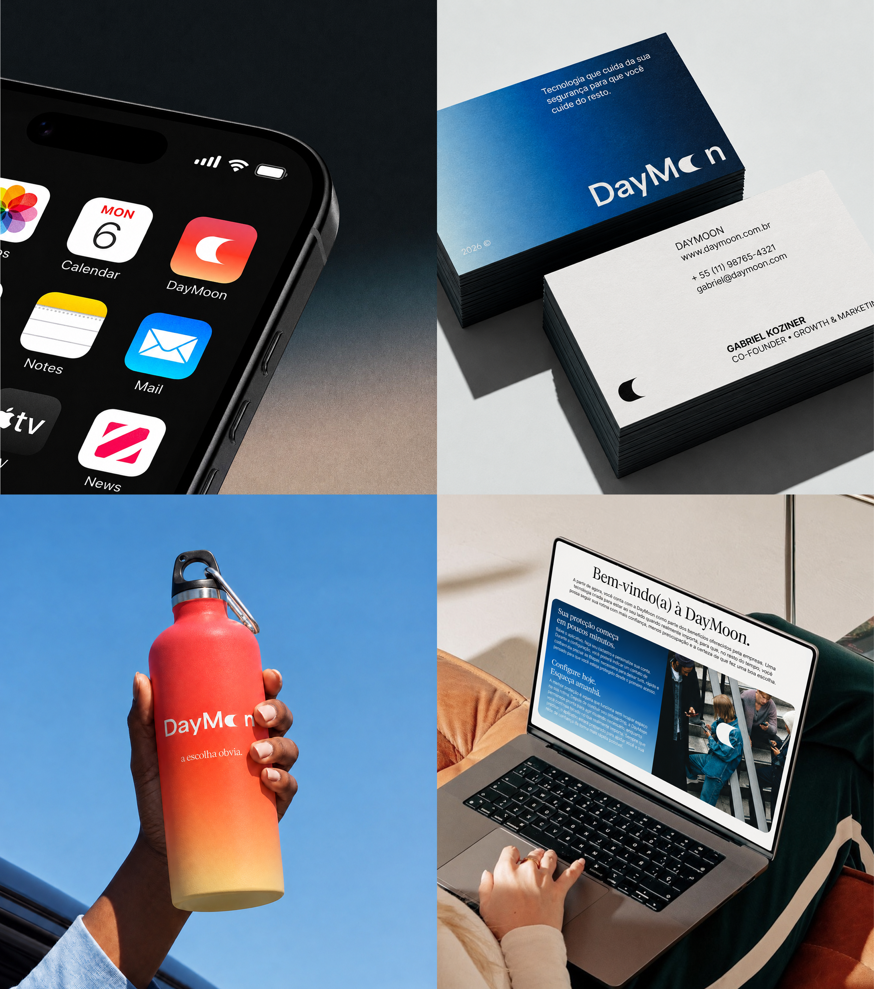
Across touchpoints, the identity stays recognizable with very few elements: the moon, the gradients and generous space. From business cards to a water bottle, from the app to the web, every piece carries the same lightness.
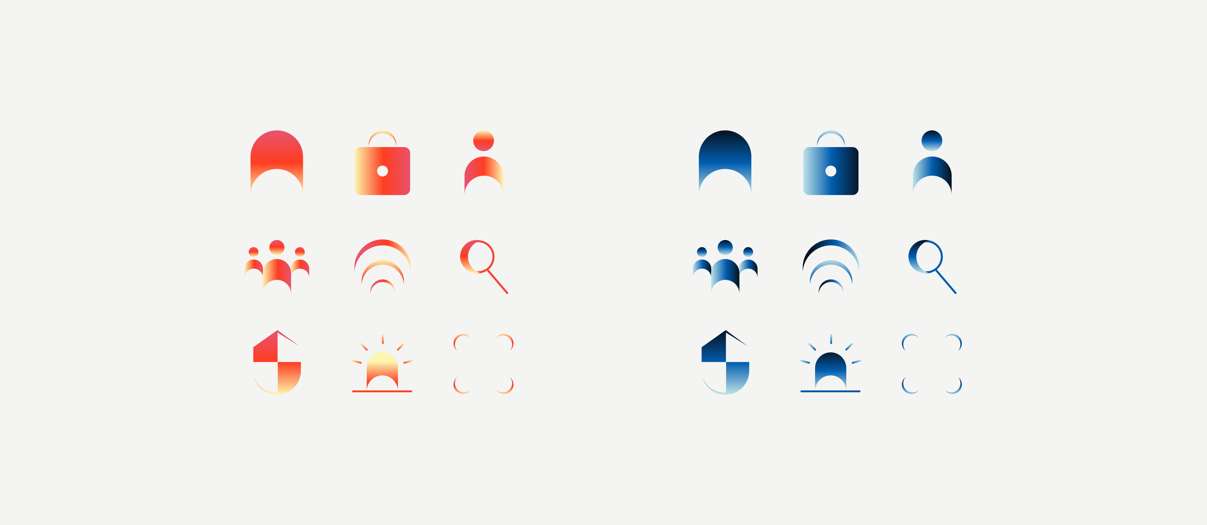
The iconography is built from the brand’s own vocabulary. Shield, lock, people, signal and alert are redrawn with the arches and curves of the moon and filled with the day and night gradients. Even the most charged symbol in the category, the siren, loses its alarmist weight and becomes part of a softer, more human language.